
Innovecs New Visual Identity Website
Rethinking brand image & website design for global IT service provider
Innovecs USA
Identity, Website
June 2019
Curtains.js, LocomotiveScroll.js
According to Inc. Innovecs is one of the most fast-growing US companies & has an outstanding engineering team.
We were asked to create a new visual communication language design to emphasize the company’s forward-thinking culture.
The 'NN-swoosh' — new simple, but emotional & dynamic symbol, now serves as a cornerstone in Innovecs visual communication platform.
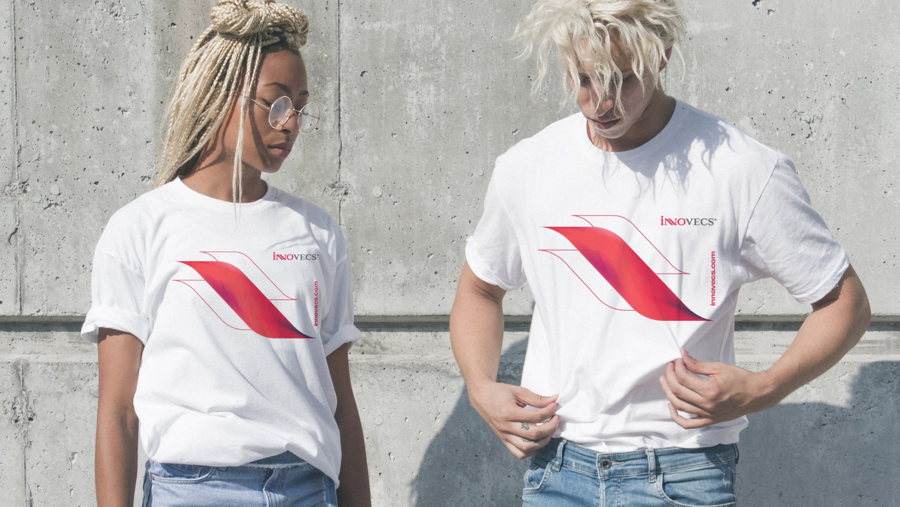
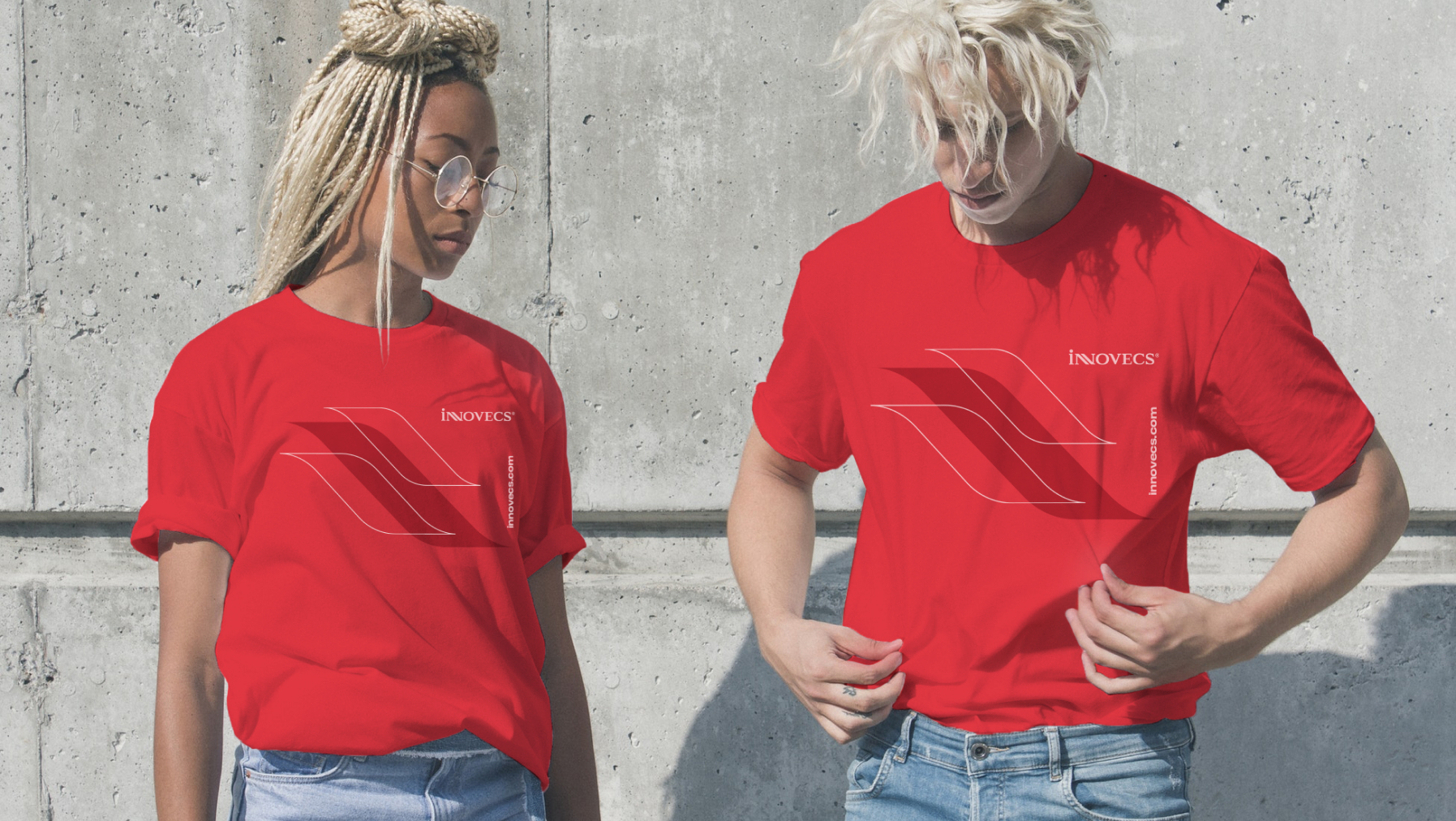
Generative 'fire' illustrations are aimed to reflect the metaphor of passion, dynamic and forward-thinking nature of the company.
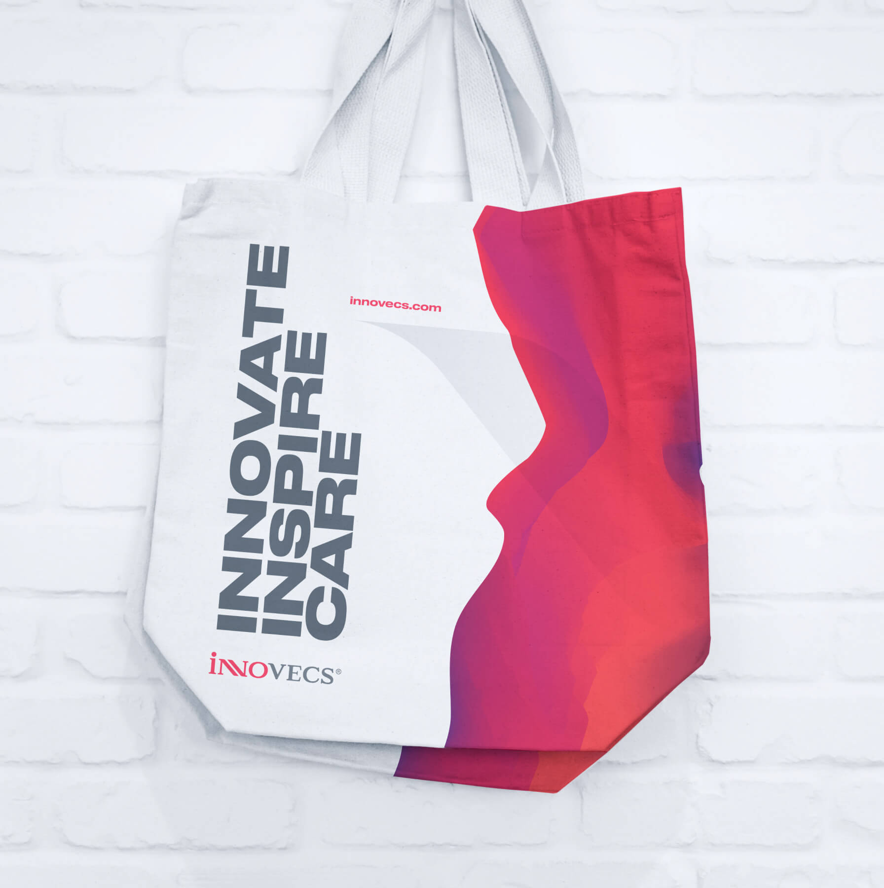
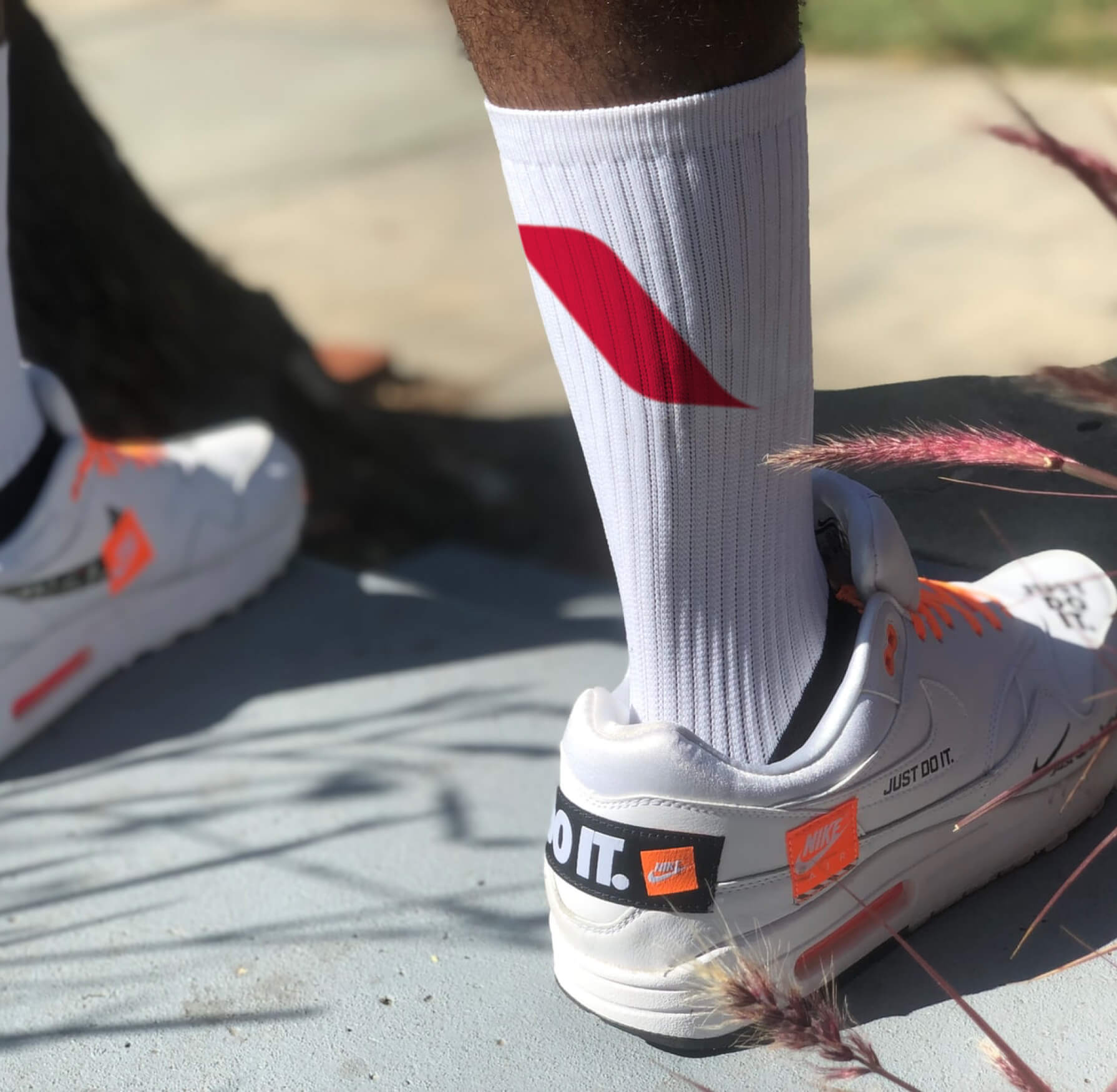
Identity guidelines and a large number of usage examples allow in-house designers & marketing teams to scale to numerous activities.
As to marketing CMO, the new visual identity was warmly received by an absolute majority of employees and customers.
As a part of the project, we were asked to create Innovecs website design concept to align it with the new brand image.
The new website is interactively smooth (just like branding) ...
... and with small but noticeable details all around the pages.
... and with small but noticeable details all around the pages.
The site was developed by Innovecs in-house dev team.
“The new identity was warmly received by employees and customers. Guidelines and a large number of usage examples allow designers to scale the project on all marketing tasks.”
Alex Lutsky, innovecs, CEO

-
7 0
Milestones for each stage of the product
-
231 0
Design elements created
-
12 0
Samples for interaction design & visualizations
-
>10 0
Weekly sync-ups and discussions